City Branding in Japan
#1 Introduction
Japan does an excellent job of branding itself, be it on a national level, like utilizing it’s cultural assets at the Olympic closing ceremony in Rio, or the municipal level, with mascots, city flags that are coherent yet beautiful and several other little touches that really add up.
I’m sorry if you were expecting a continuation of the series of blogs about Kyoto I had advertised in my last post, but I am just not motivated enough to sort through the thousands of photos and to do research and everything just yet, so if city branding is not something that interests you, come back really soon and you might find something that is more up your alley, or stick around, you might find a new field of interest.
#2 Mascots – Yuru-chara
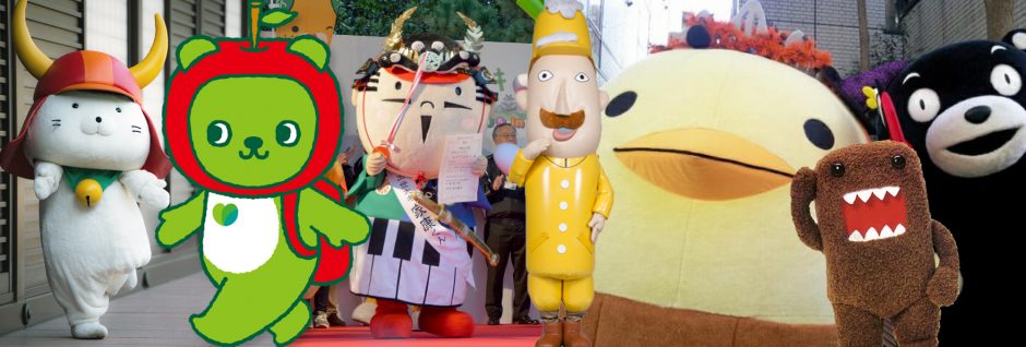
f.l.t.r.: Hikonyan [Image © Takashi Hososhima]; Arukuma; Leyasu-kun; Reruhi-san; Bary-san; Domo-kun; Kuramon
Japanese Mascots have been incredibly successful. In 2012 alone, these mascots generated over $16 billion in revenue. That’s US dollars, not Japanese Yen by the way. They are that popular. They appear in television commercials, and there is a seemingly endless supply of merchandise available. I actually own a badge pin of Hikonyan, which I bought while visiting Hikone Castle in Shiga Prefecture. When I got back to school in Nagano Prefecture, people recognized the mascot immediately.
You might even have seen some of these before, like どーもくん [Domo-kun], the official mascot of the NHK, Japan’s national public broadcasting organization [which I’ve actually been before].
Another famous example that appears everywhere is くまモン [Kumamono], whom you can find practically everywhere in Japan
These mascots are incredibly popular, and every year the Yuru-chara Grand Prix is held to determine the most popular mascot of the year. In 2015 there were over 1,727 entrants and over 50 million internet votes cast. Hikonyan won in 2010, Kumamon and Bary-san the following two years. In 2015 Leyasu-kun was crowned victor. You can find all of them in the image above.
There is an incredible versatility when it comes to mascots.
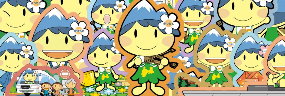
In the image above you can see Alpi-chan, the mascot of Matsumoto City, and yesterday she greeted me at the train station as part of a campaign to stop youth drinking. There was quite a queue to take pictures with her.
On the Matsumoto website, you can find over 60 designs to download, and a form if you would like to license one of them and receive a vector file. You can find these everywhere, from the lottery shop in front of the station to little flyers and menus.
There are mascots both on the prefectural but also on the local level, in the image above you can see the mascot of Nagano prefecture, being Arukuma, the walking bear with an apple head. The mascot for skiing in Niigata Prefecture is Reruhi-san, who is modeled after Theodor Elder von Lerch, an Austrian Major General, “the ambassador to winter leisure sports”.
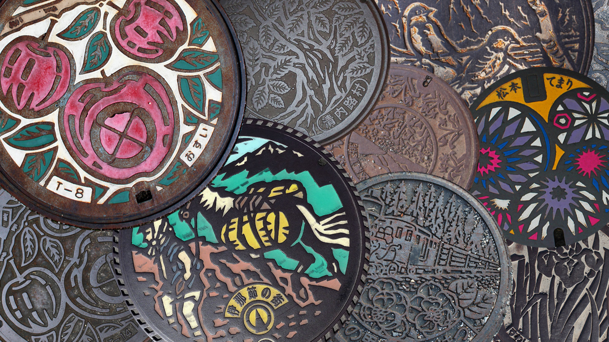
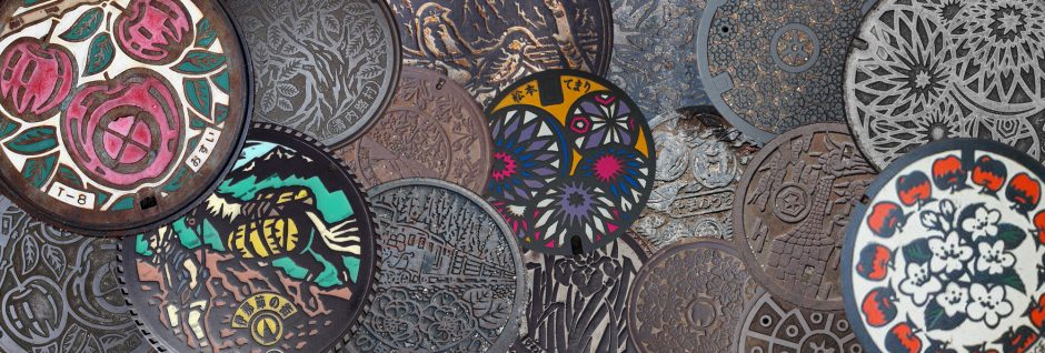
#3 Manhole Covers
From top to bottom, left to right; Iida, Iida, Seinaiji, Ina, Souga-Nanbuchiku, Agematsu, Togakushi, Matsumoto, Suwa, Azumino, Yamanouchi, Nagiso, Kyoto, Kyoto, Kyoto, Matsumoto, Nagano
These manholes can be found everywhere, and every town sports a unique design. In the image above you can see just a small selection of the hundreds, possibly even thousands of unique designs out there, these are only the ones I have spotted so far. Here is a more complete collection. They are all made by the Nagashima Foundry.
Something I thoroughly enjoy is the actual history on why these colourful manholes actually came to be. In the 1980s, the Japanese government decided to renew most of the sewage systems outside of big cities like Tokyo. These projects began to face resistance, and apparently the introduction of customized manhole covers softened the blow… At least that is what I believe to have happened, or at least what the book Drainspotting seems to be about.
It is always easy forget that even the most simple day-to-day objects need to be designed, and just putting a bit of extra effort really creates something special. Not only are the big manhole covers beautifully designed, the tiny ones are coloured brightly in almost every shade imaginable. The covers for firefighters [I am guessing these replace the function of fire hydrants] also have unique relief designs in white and bright yellow, and look quite stunning.
Quite a few people search and collect images of these manholes, and there is even an official card game featuring the designs. It was featured on TV just a few days ago which is actually what prompted me to write this article.
#4 City Flags
When I google the term “City Flags”, the top results are things like;
Are These The Ugliest City Flags on Earth? – City Flags Are a Hot Mess. – What City Flags Would Look Like If Actual Designers Created Them
That does not seem very promising, there is actually a TED talk on the subject focusing on some of the worst American city flags.
Let us now move away from American flags [I am picking on America because they have some particularly bad examples, Austria for example is rather boring in comparison,] to Japanese municipal flags.
f.l.t.r.: Matsumoto, Suwa, Hida, Ogaki, Nagano, Sakaide Hashimoto, Watari, Iide, Kameda, Gifu, Uryū, Osaka Shimabara, Tsushima, Hitoyoshi, Hyuga, Miyazaki, Rikuzentakata
Those are just a few of the many city flags in Japan, the first one is Matsumoto. Granted not all municipal flags look like this, and there are a few that look a more like private resort logos, however on a whole, these are quite beautiful. Japanese design is known for it’s minimalism, and this is a perfect example.
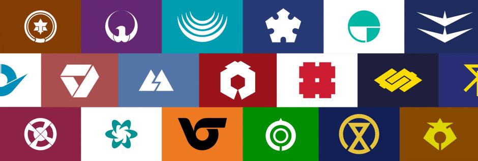
It’s not just flags, but also city logos that surprised me. Take Shiojiri, the city is known for it’s grapes and wine, and the branding reflects that, while being versatile and elegant.
#5 Signage
This is an odd thing to focus on, but I talked about man hole covers before, so bear with me. If you have ever been to Vienna, Austria, you may have realized that there are traffic signs everywhere. They are huge and quite irritating. No parking signs alone take up an unreasonable amount of space.
Here Japan comes into play.
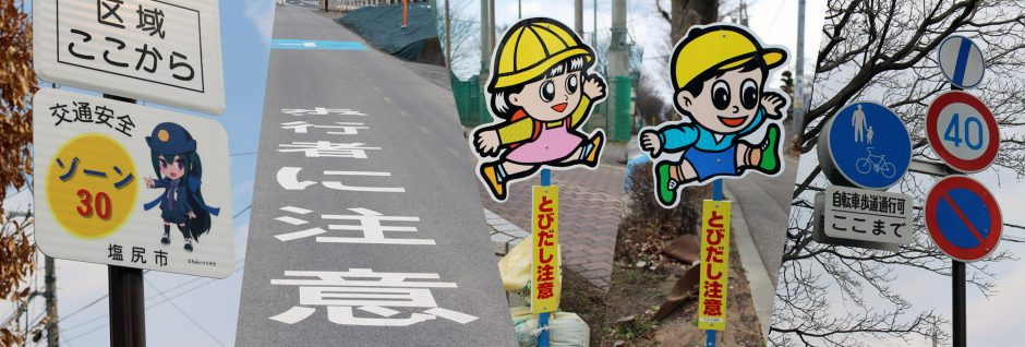
The first thing many places in Japan tend to do is put a lot more writing on the floor, which makes walking around a lot more pleasant. There are even quite adorable little signs to tell you to look left and right at crossings, this one from Shiojiri, the one in Matsumoto uses one of Alpi-chan’s variants.
Secondly, sign sizes vary, which means on smaller roads, the signs are also smaller, and things like no parking is always in the smallest size. The signs close to the highway are always large. This variety really is easy on the eye, which is nice. There are also some cute special signs for children crossing near schools, above are just two of the many variants I have seen over time.
#6 Wrap-Up
I believe that is about all I wanted to talk about in today’s post. I’ll try to get back to writing more regularly, but as that has become a standard phrase in my wrap-ups, I’m not sure if I even believe it myself anymore.
I have most of my next blog posts outlined already, so this time it really shouldn’t be too long. These kinds of posts with lots of montages and research tend to take a bit longer, so I apologize.
That’s all for now,
send a postcard,
Yona